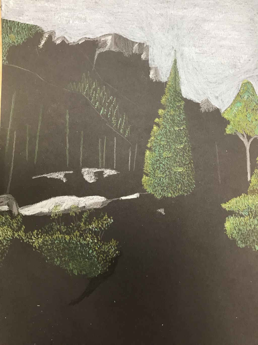
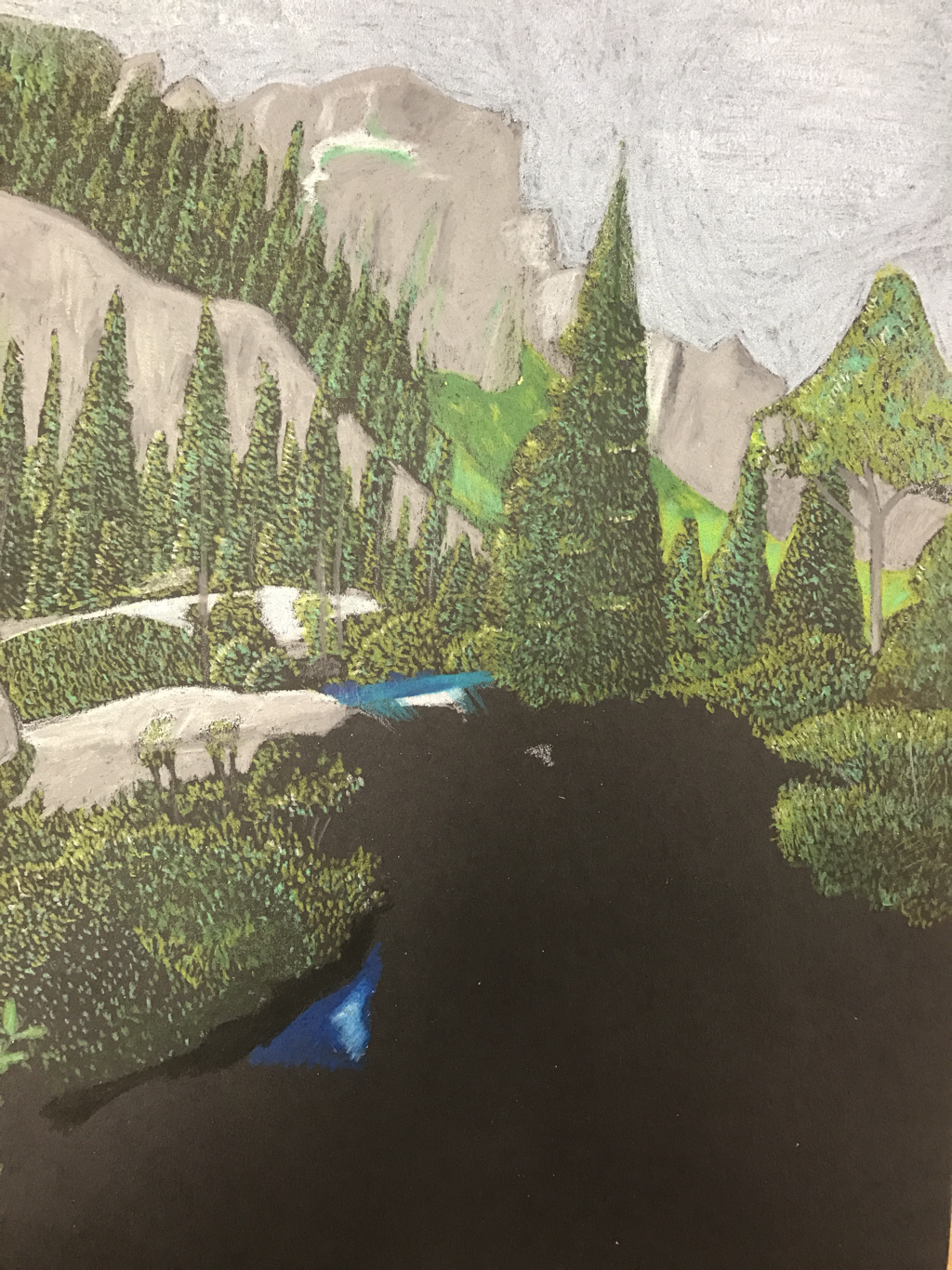
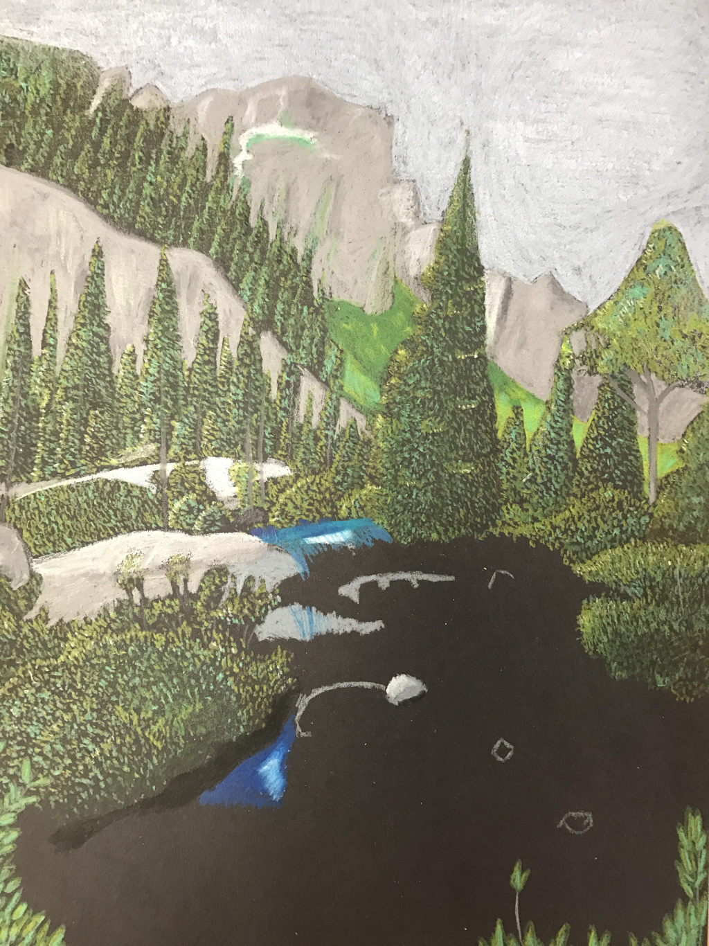
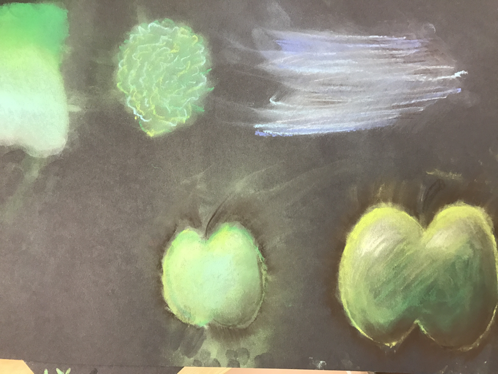
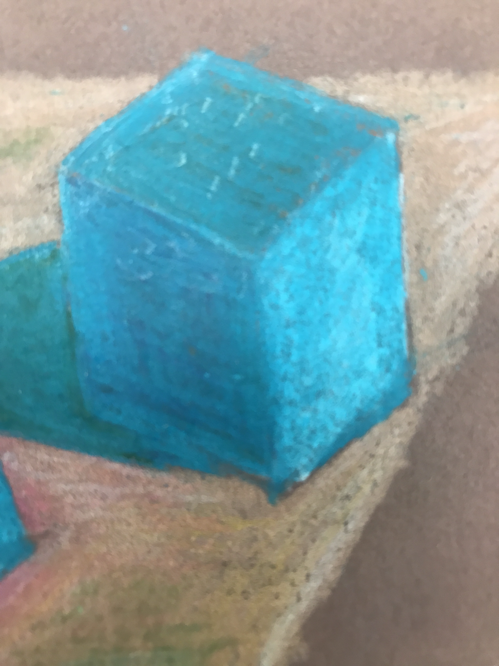
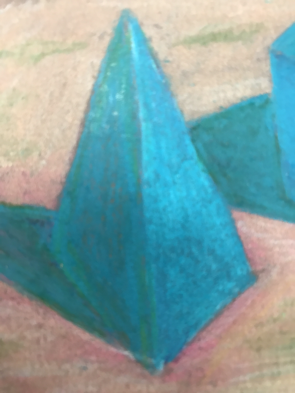
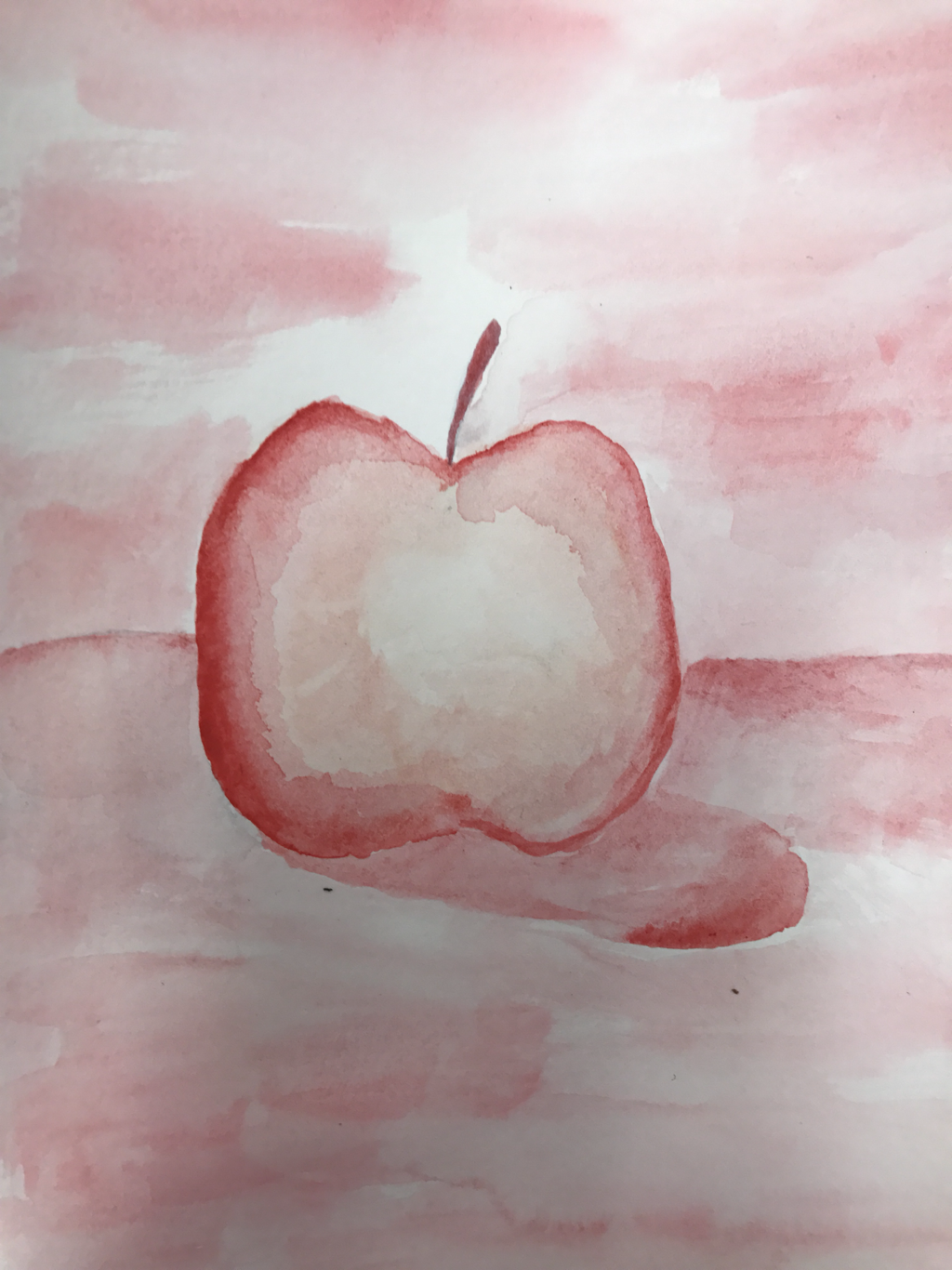
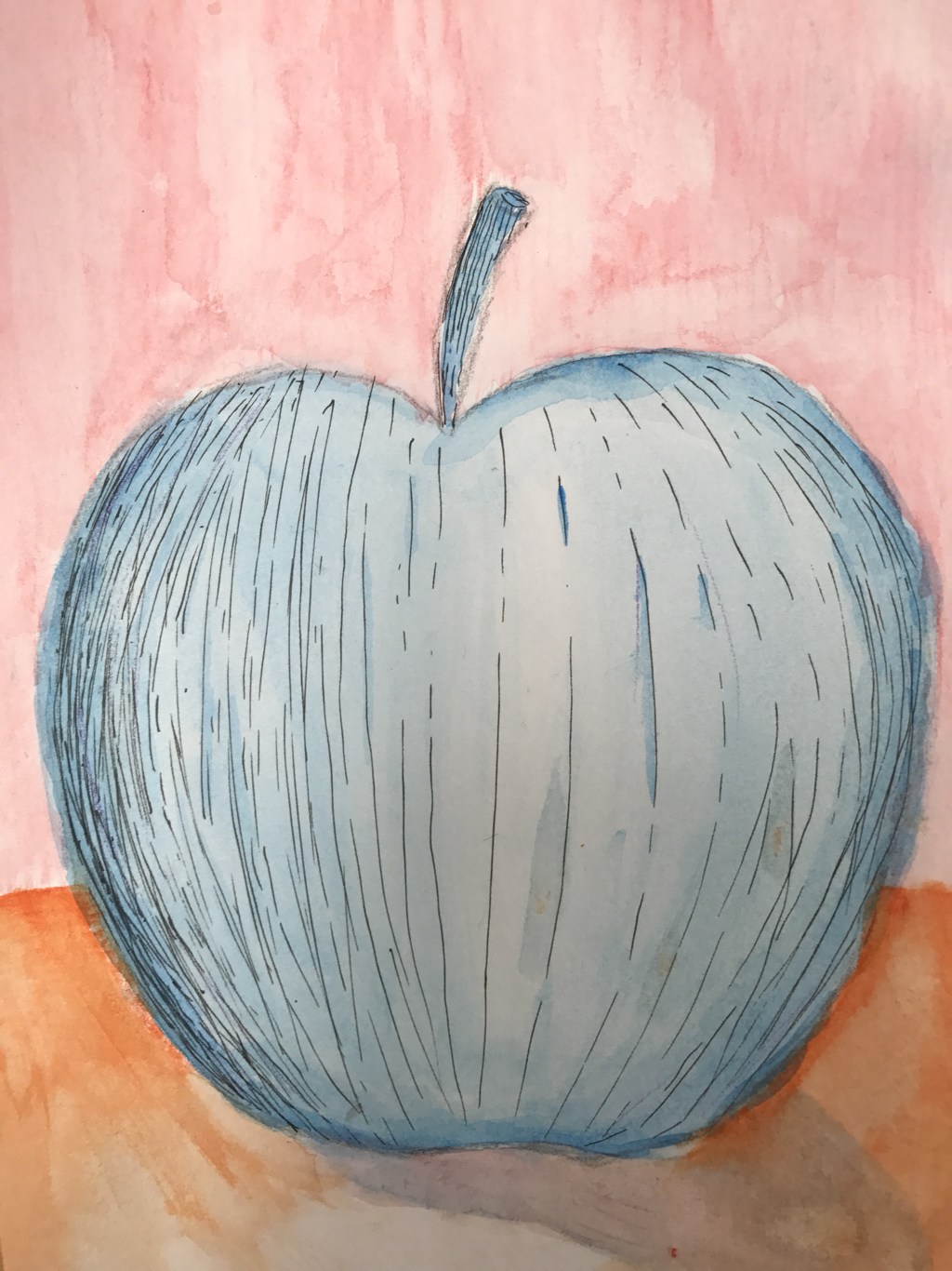
work in prOgress
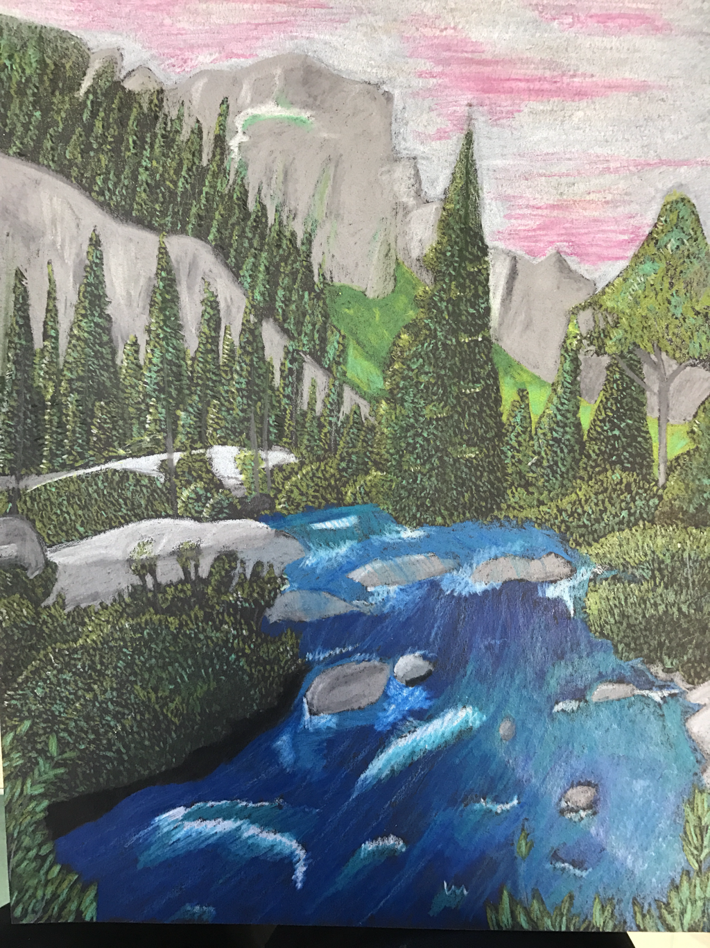
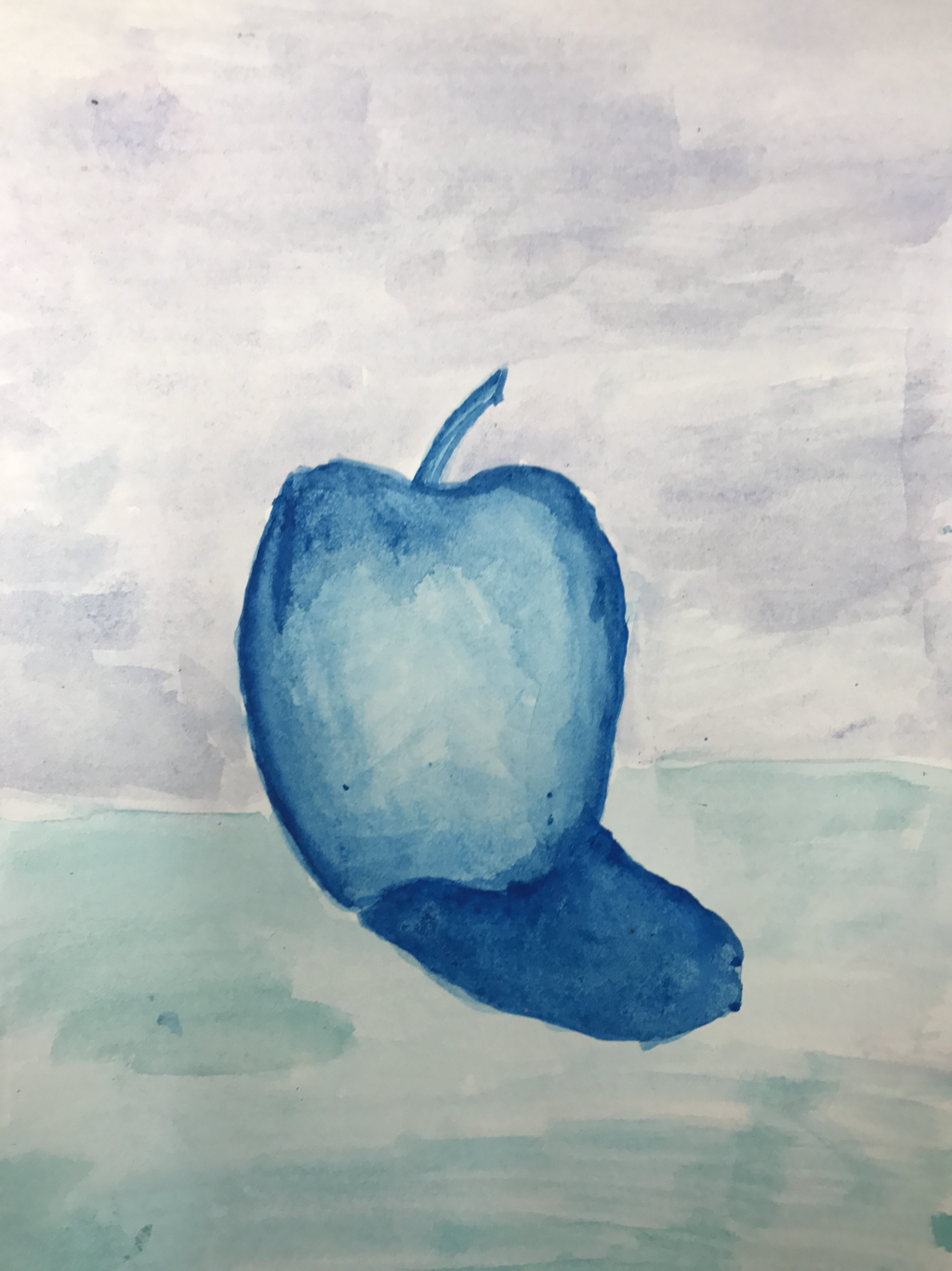
FInal pIEce
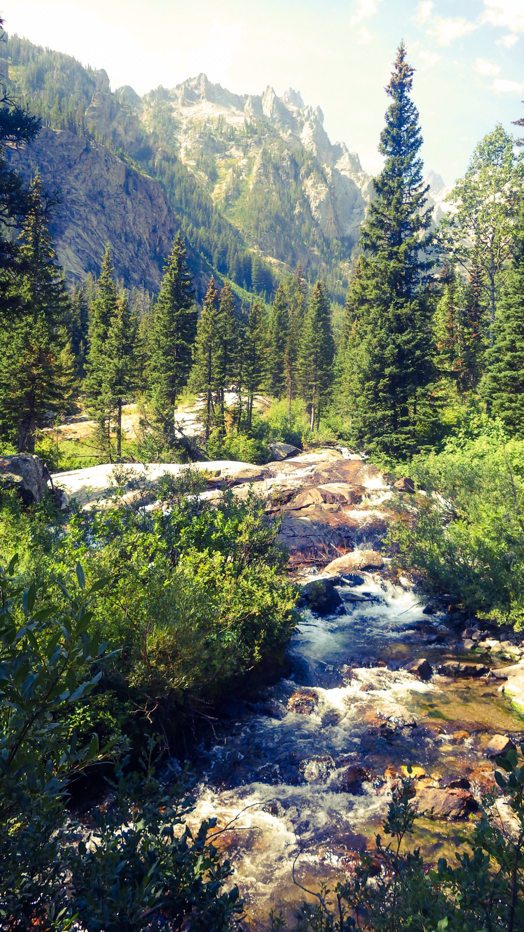
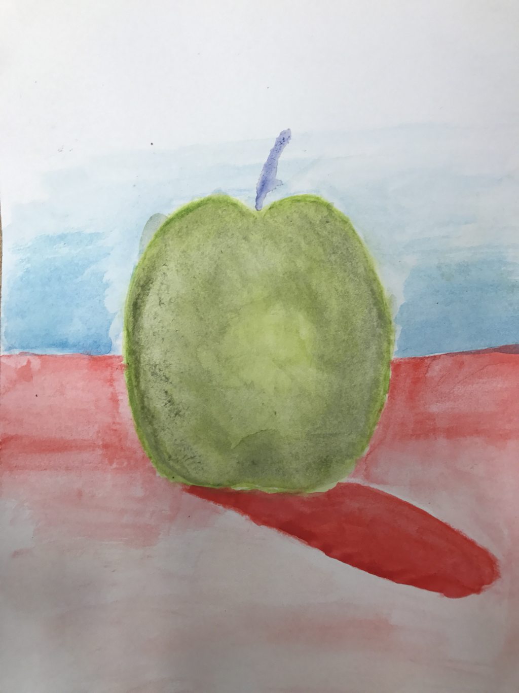
orginAl photo
1. I think the craftsmanship is well done. I worked very hard to blend the colors and make them as vibrant as possible. I also was able to use the black paper as shadows in many of the trees to make the colors pop. This ended up looking very nice and well made. I also wanted to keep the same proportions as the original image so that it looked the same. I personally like the layout with the mountans in the back so I wanted to keep it. I also worked very hard not mix the colors and keep it as neat as possible so that it looks good and professional.
2. I think I used a wide range of colors to make it look as vibrant as the colors in the photo. I also used the black paper to help create depth where I didn't add any color. I also used up to 5 shades of green to create a wide range of colors.
3. I also think that I used a wide range of colors like Georgia. This makes it look vibrant and colorful just like her paintings/drawings.
4. My choice of colors was bright and vibrant to pull out the very best colors. I only used light colors to make the work more colorful and happy. I also tried to used as little black as I could and used very little dark colors. I also like how the green and aquas go together very well and add to the brightness of the work.
5. I used contrast in my painting by making the trees where they overlap one side much lighter and one side much darker. That way you could see where one tree ends and where another begins. I also made sure to make the mountans have many different shades of gray to make sure you could tell where one slope ended and where another began or where a cliff was.
6. The most used texture that I had was the use of a semi stippling dotted pattern for the trees. This defently showed that they were pine trees and showed that they had a texture. At first I was not expecting it to look good but after I did a good amount of the trees I thought it was a much better representation than just drawing it in color pencils with no texture.
7. The greatest difficulty for me was getting the water so it would look as realistic as everything else and not ruin the piece. It was difficult because I also had to include many rocks in the work and make the water look realistic when it would flow around the piece. This was difficult because you couldn't blend the grays with the blues but you had to blend the shades of blue together.
 RSS Feed
