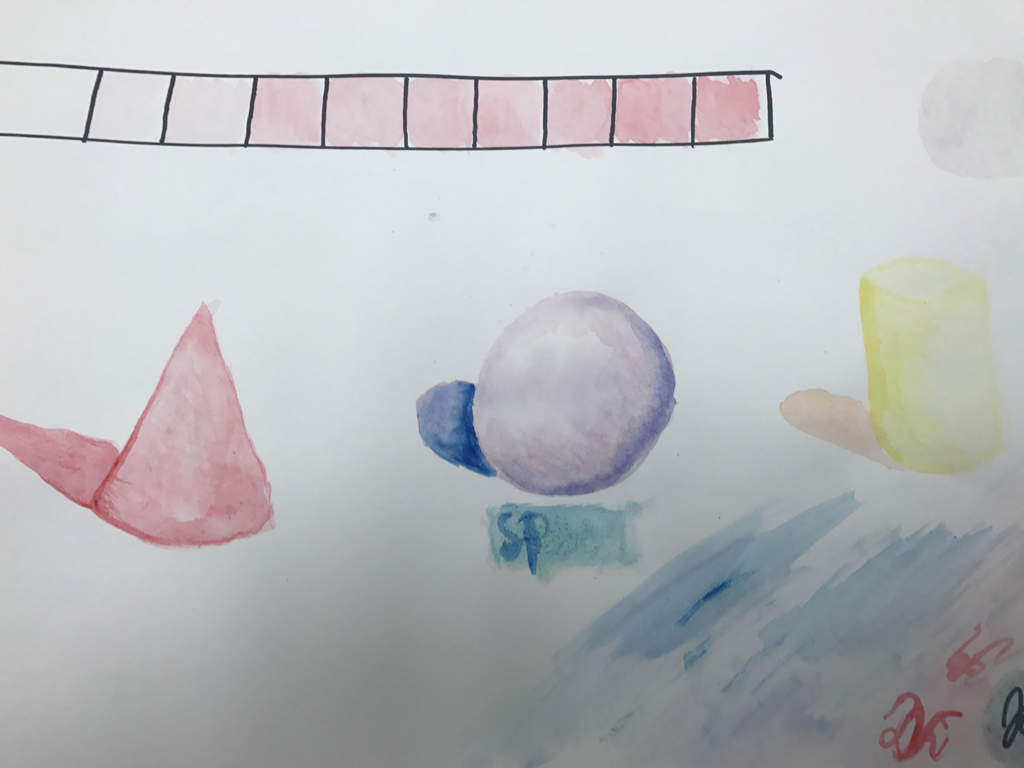
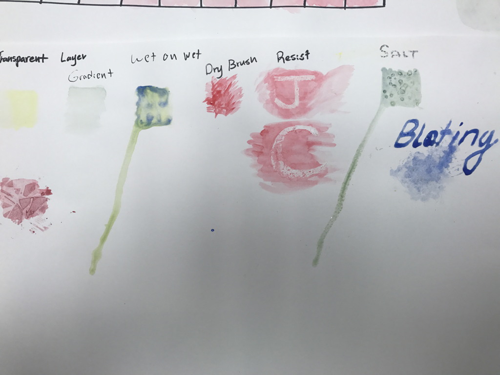
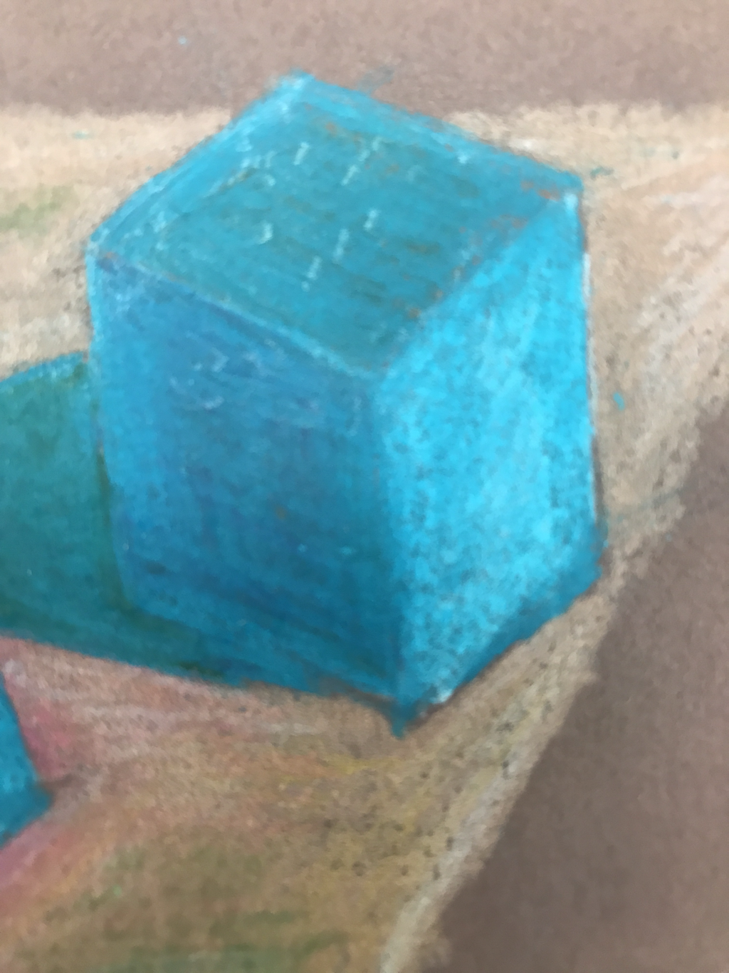
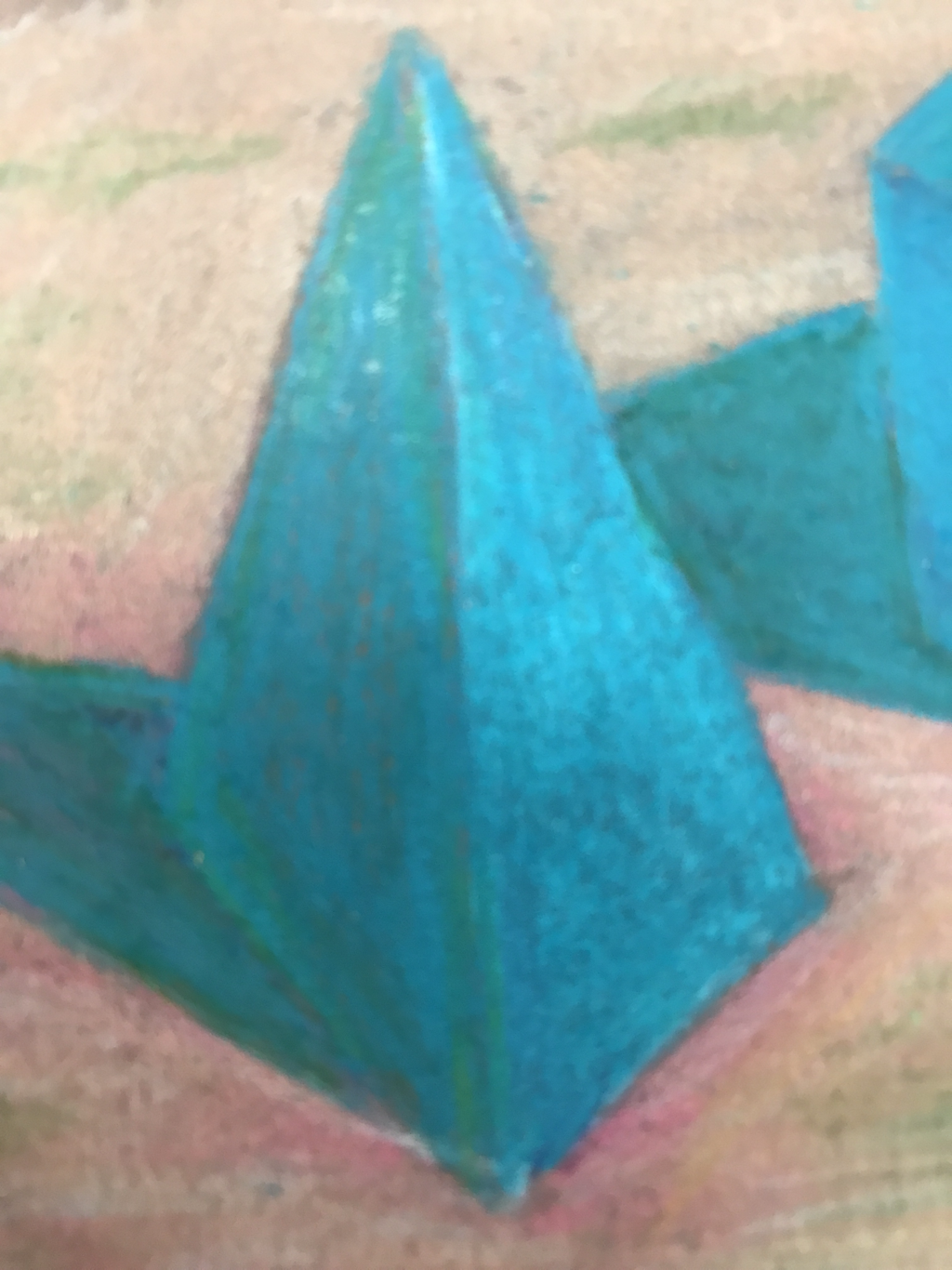
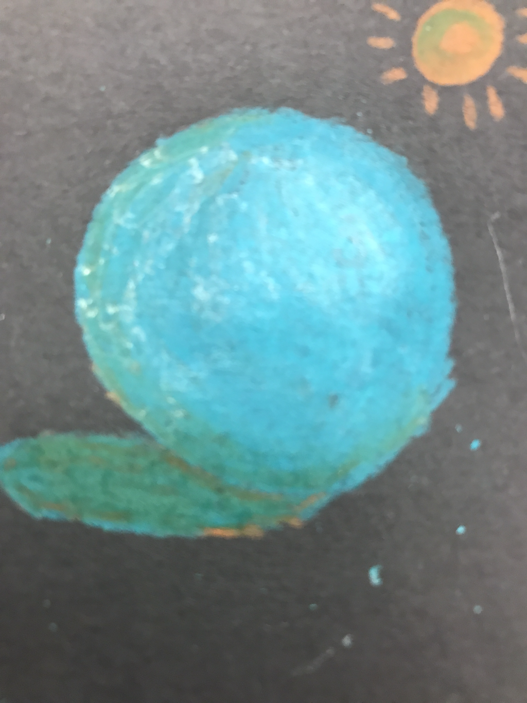
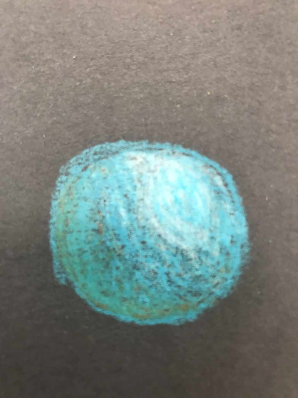
 Monochromatic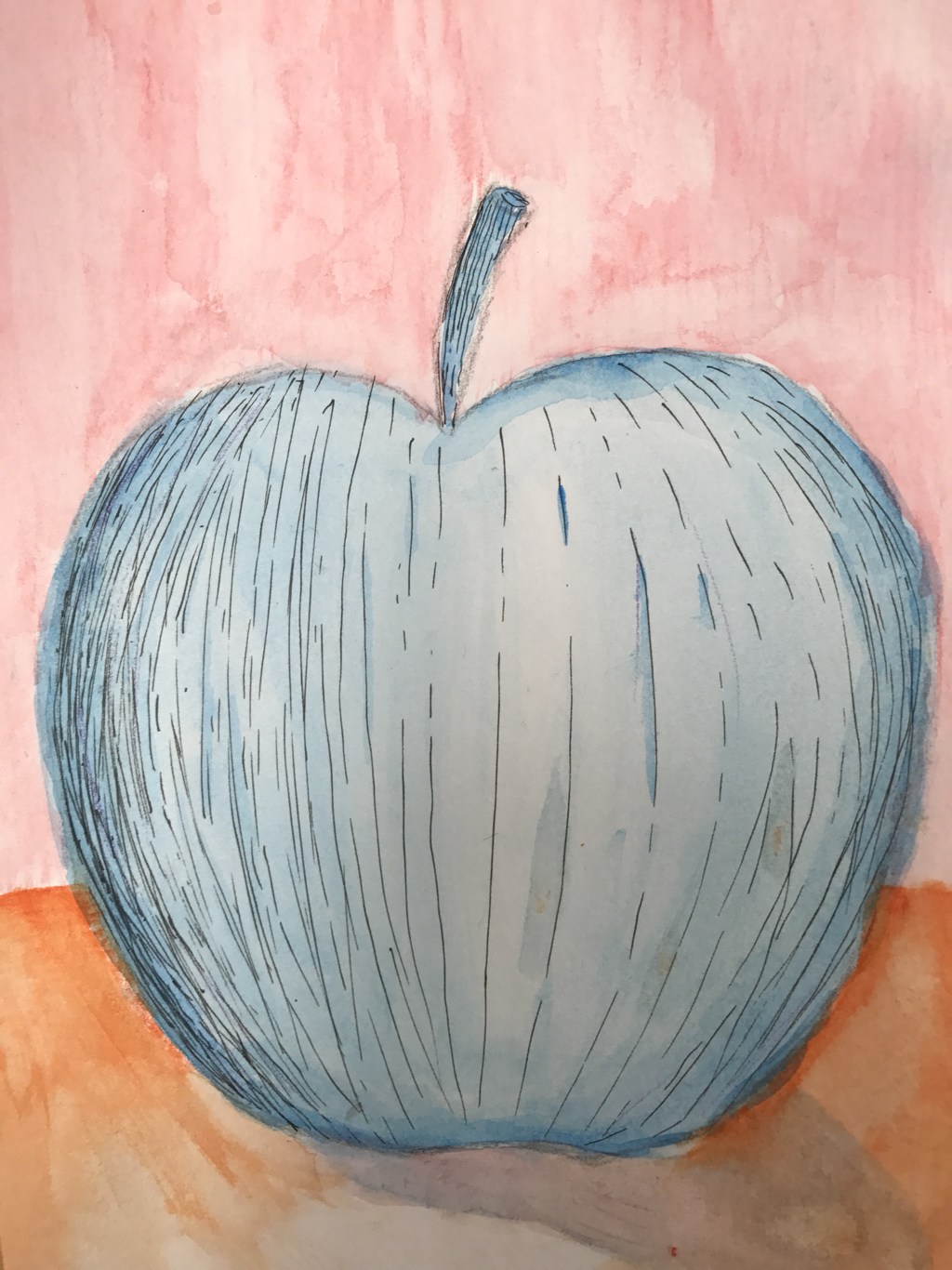 WaterColor with pen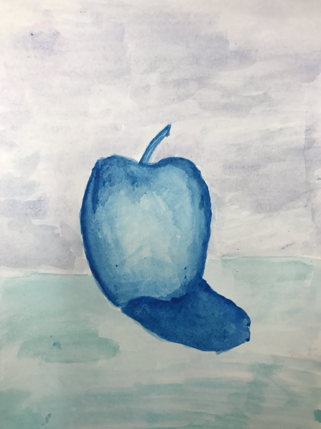 Cool colors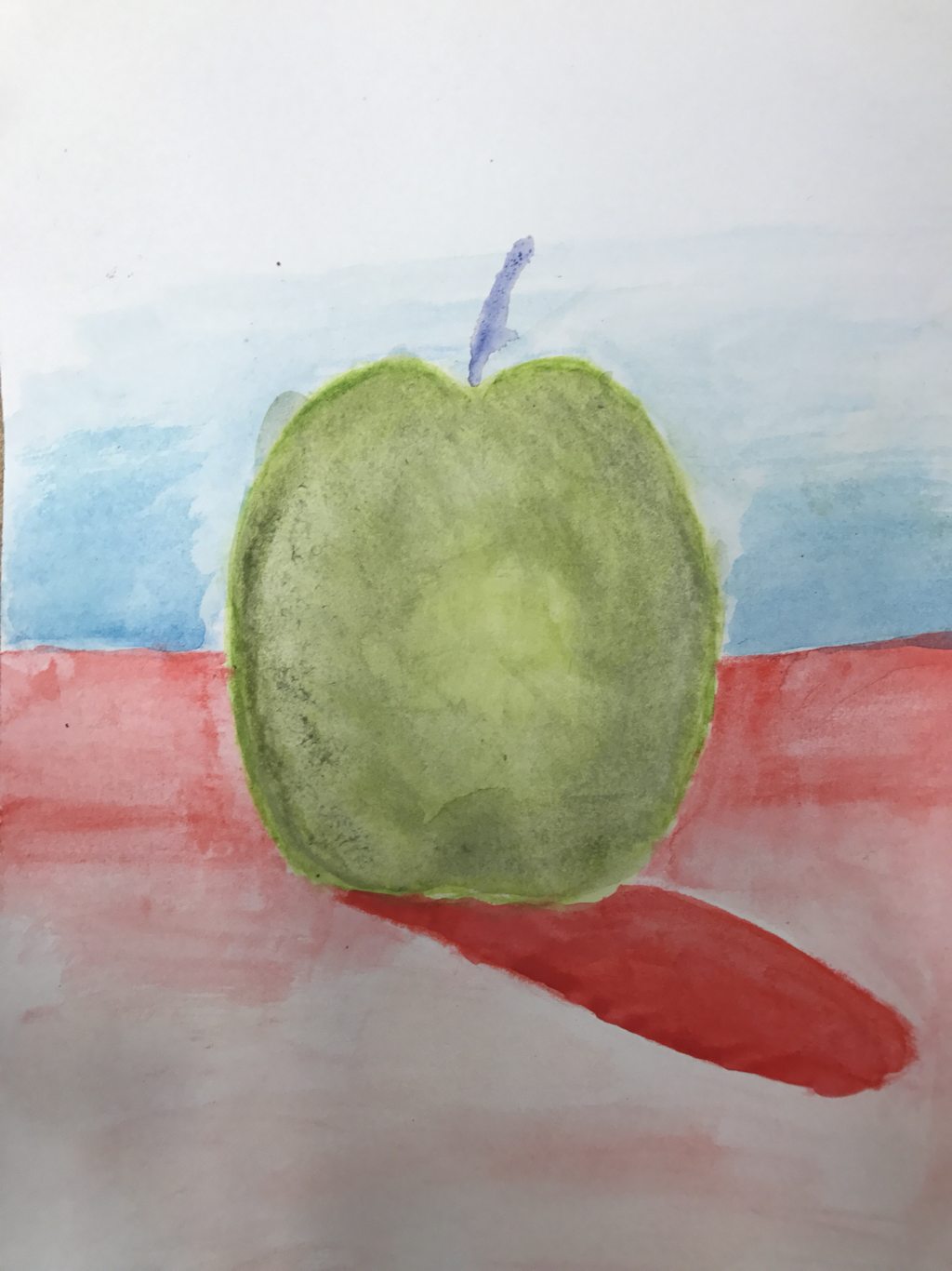 colors of choice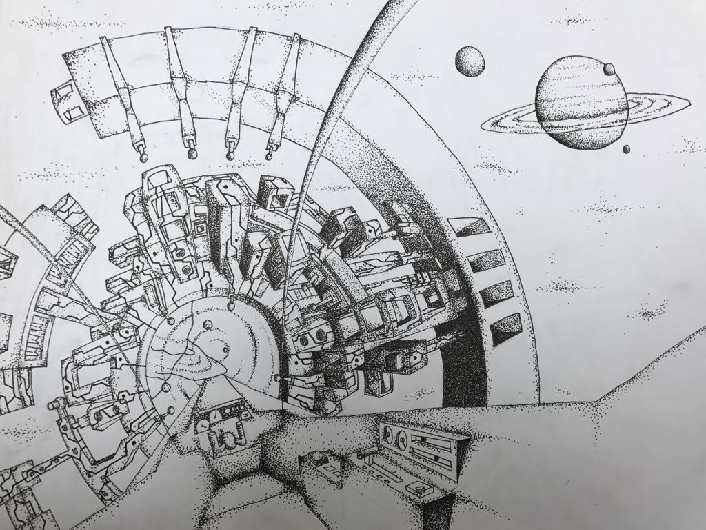 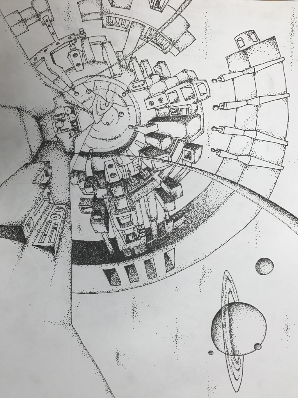 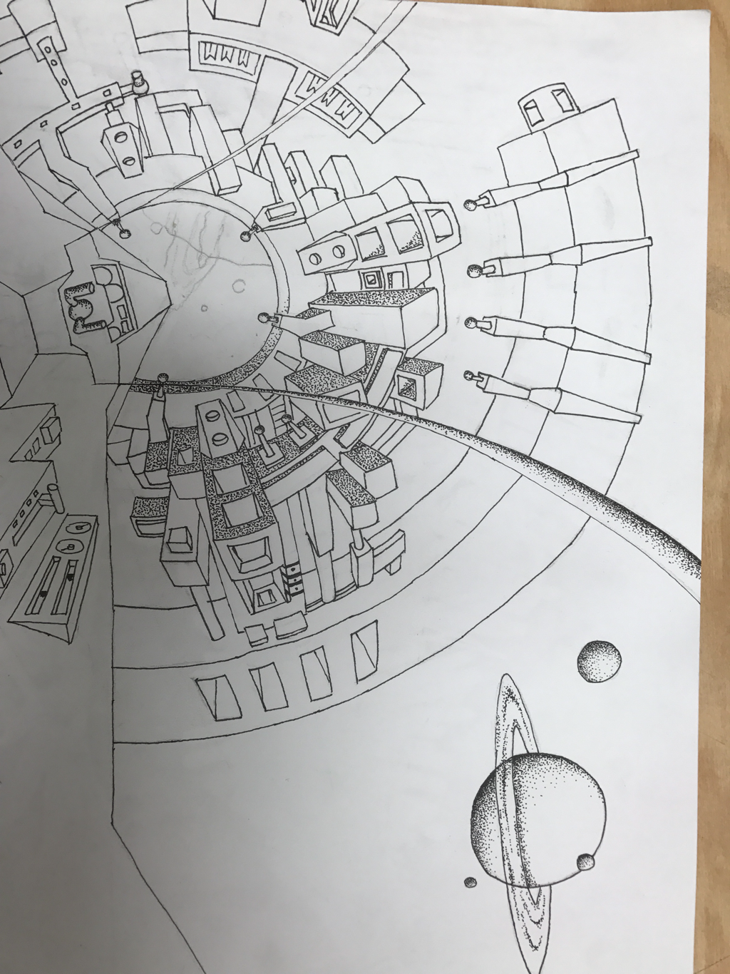 perspective projectThis is my drawing of a starship entering a wormhole traveling from our solar system to another. compositionAl schetches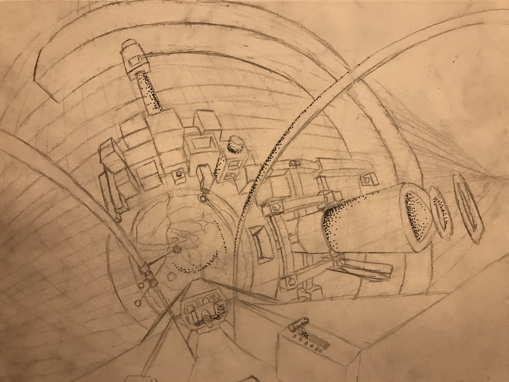 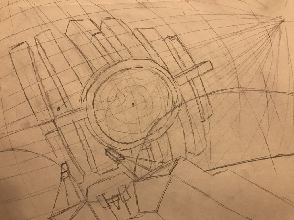 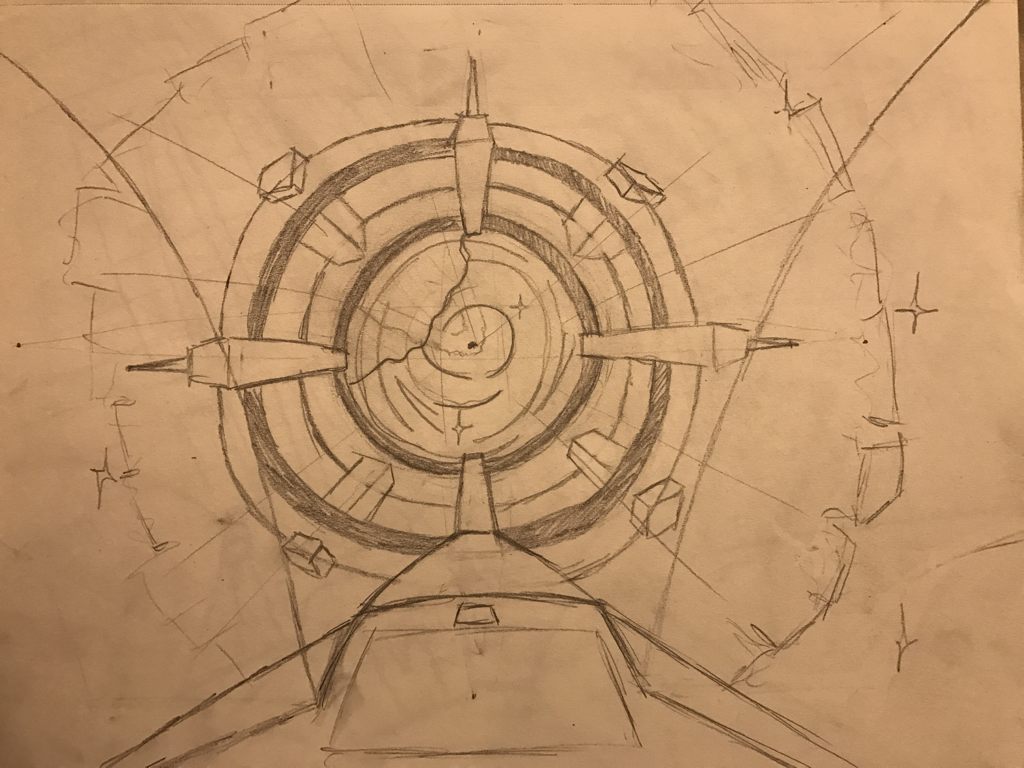 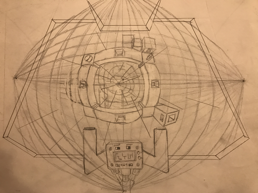 refrence Photos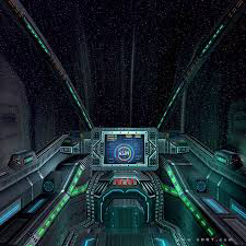 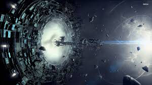 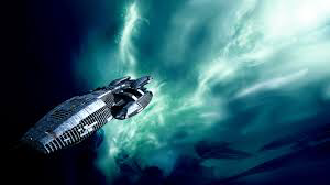 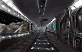 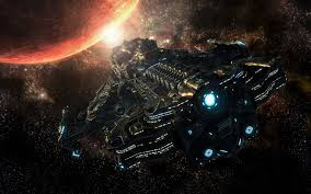 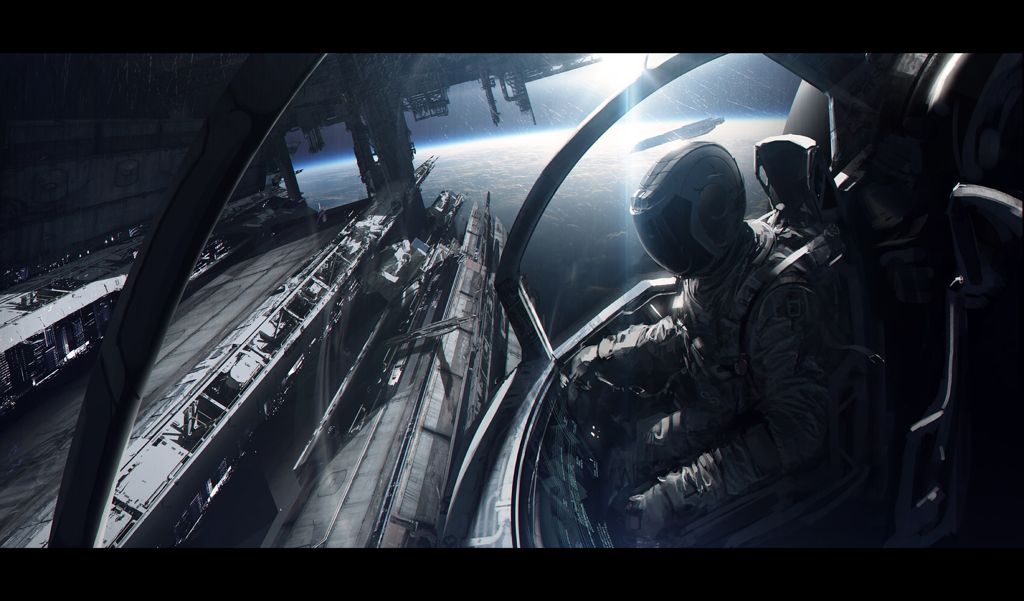 critique questions1. I chose stippling as my pen and ink teqnique for shading. I chose this one because I liked the way I could make the shades of color shift from one to another. 2. I used five point perspective to make it appear that the ship was moving fast and I used one point perspective in the ship to make it look realistic and show that the person or the location of the view was not moving. 3. Texture was not as important as it would be in other pices this is because all my surfaces were flat and smooth. I tried to use as much texture as I could but it was very difficult. I tired to make it look like the texture was like circuit boards more than any thing else. 4. value is very important because it shows which side of the portal is facing the sun and helps define its edges. Without it I'm pretty sure it would all flow together. 5. I think the piece is very well crafted. I worked very hard planning out where everything would go in my schetches and making sure it would look good. I also made sure to use a ruler for lines and thought out exactly where the shading should be. 6. If I had to recreate my piece I most likely would shade all of the space black instead of leaving it white. I didn't do this is my piece because I wanted to be able and show the stars and the outline of the ship. 7. I created a story of a futuristic space scene where mankind has gone to the stars and are far more advanced than we are today. I represented this by showing the planets in the background and part of one in the portal. 8. I think the concepts we learned in class were essential to make sure the shading looked as real as possible. Without them i am very sure my piece would have turned out very differently and not as nice. 9. I have learned how to make 5 point and 3 point perspective. I also learned how to shade with pen. This will allow me to better make pieces in pen that will be better shaded and also have a more realistic look. 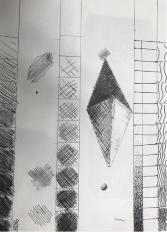 the value charTs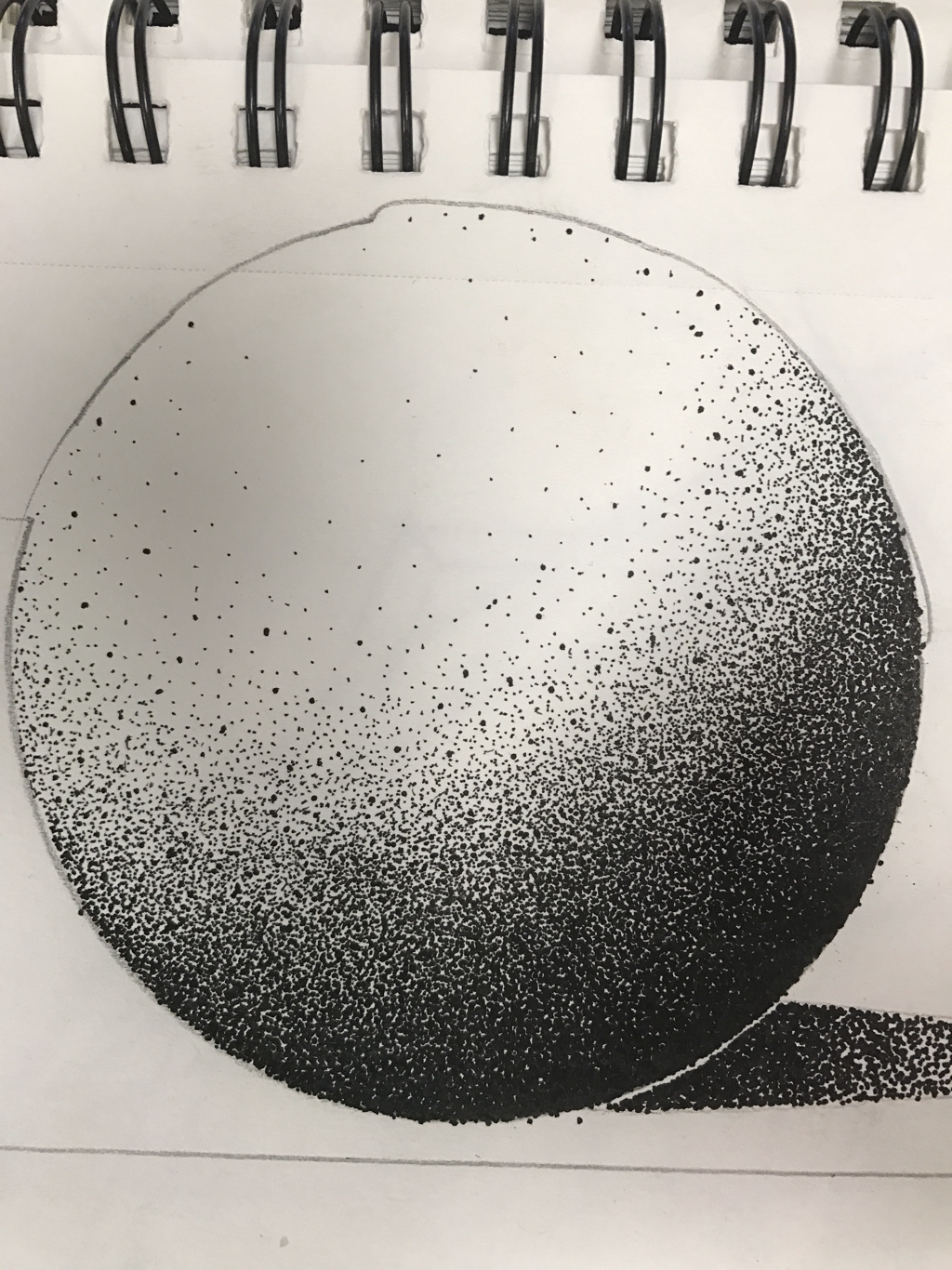 sphere fOrm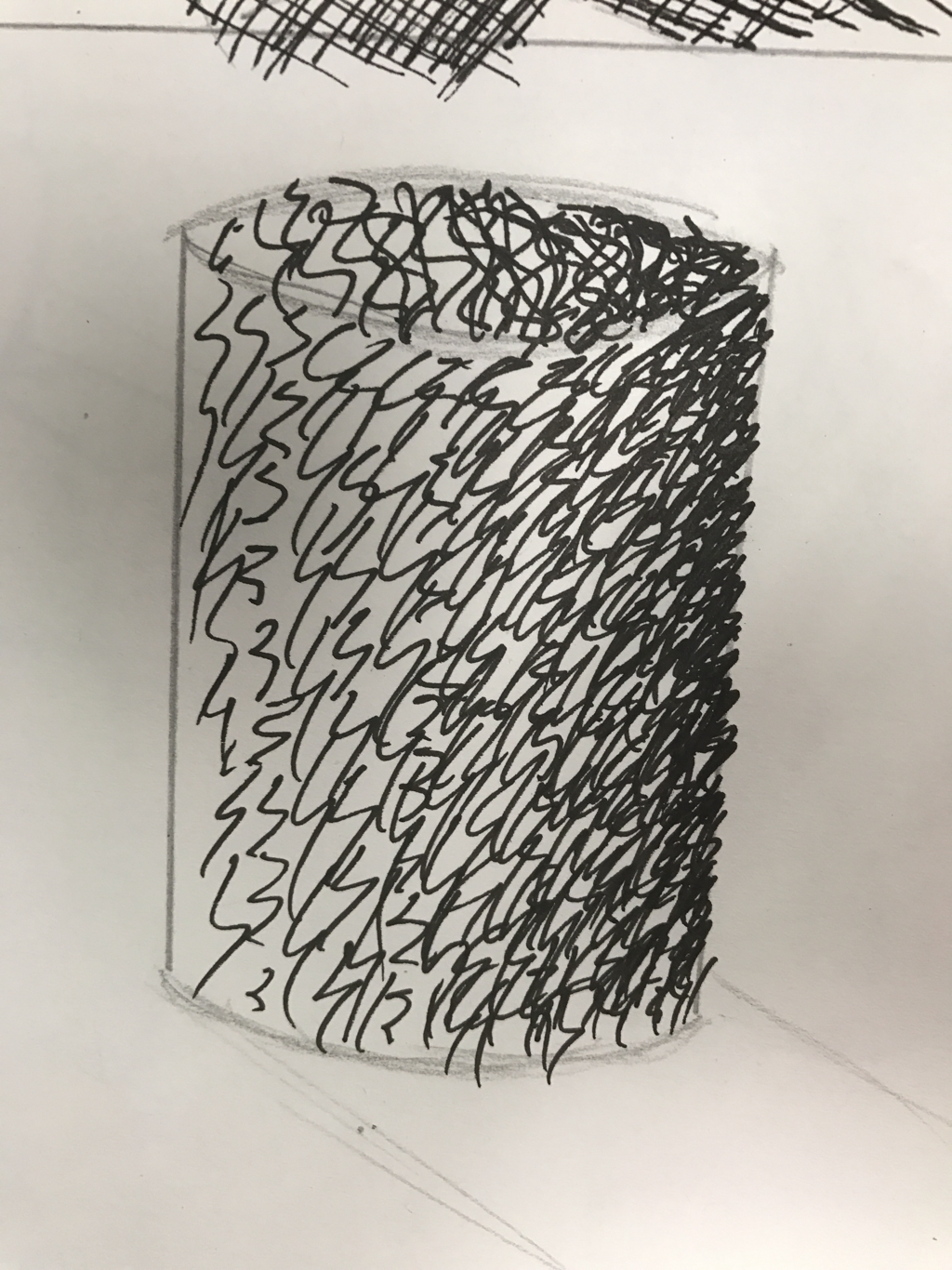 cylinder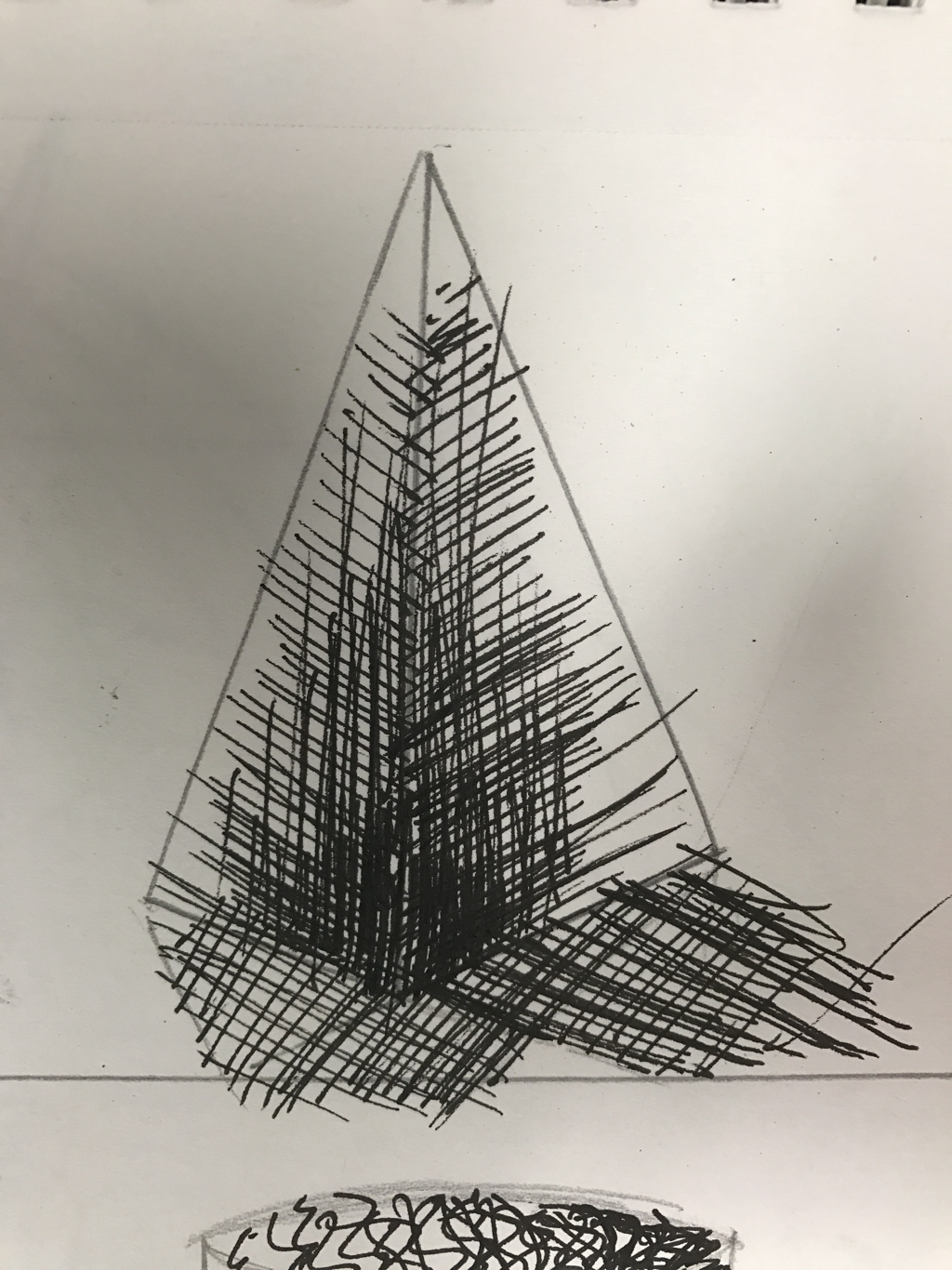 pyramid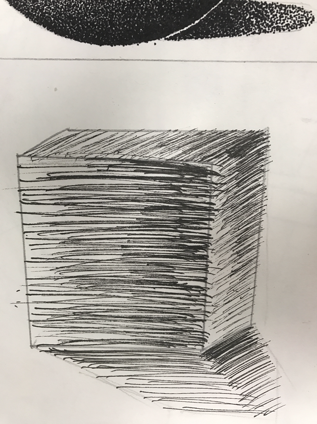 cube form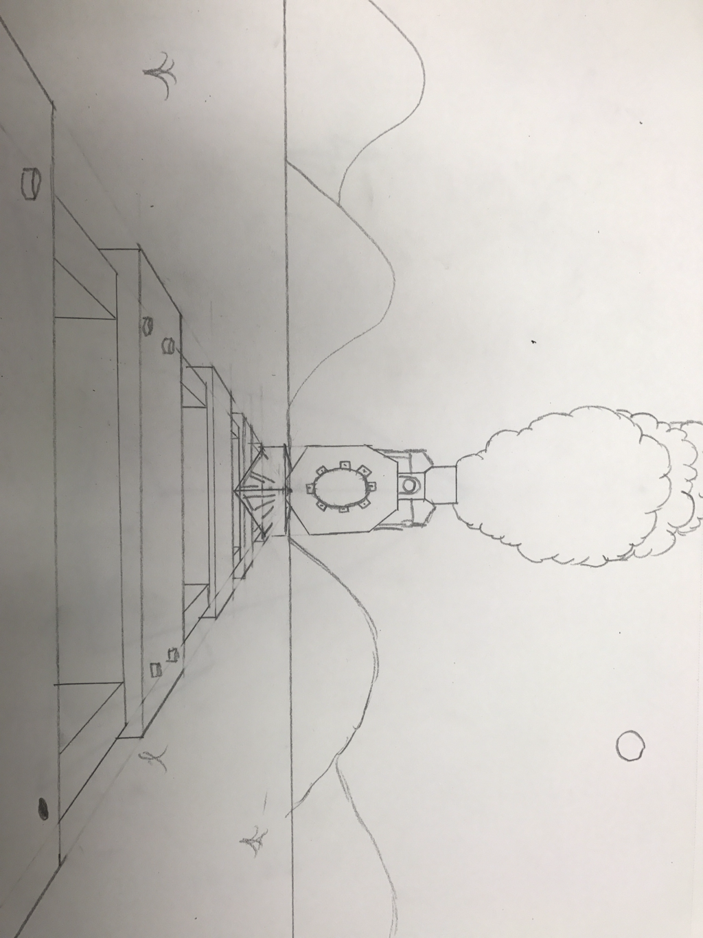 one pointFor the one point perspective I drew a train down railroad tracks. 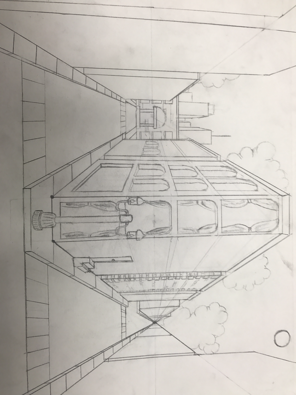 Two point For two point I drew a city view of two roads. 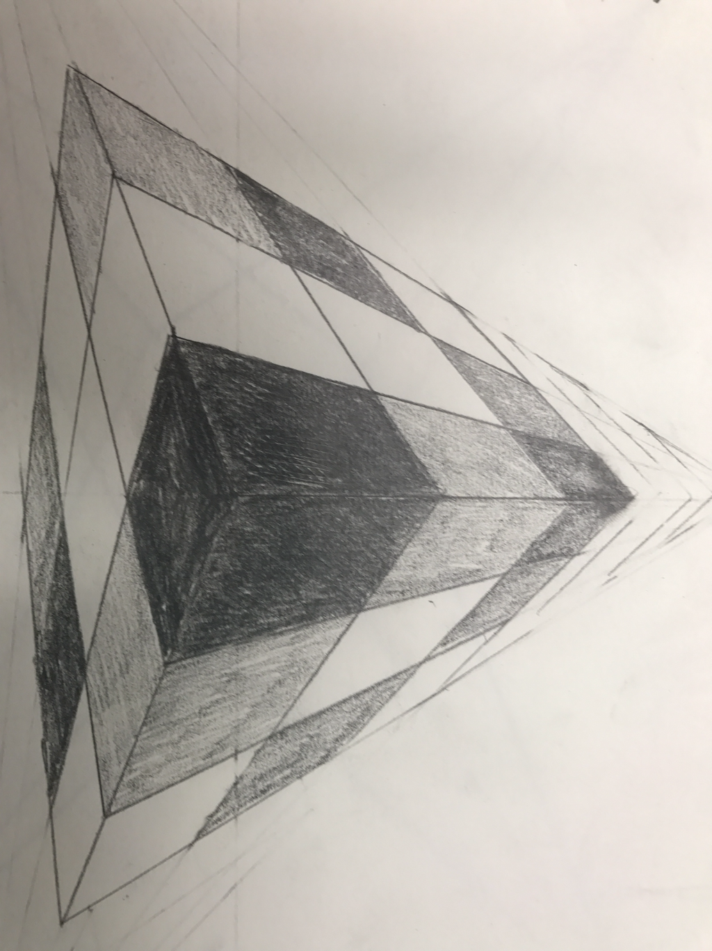 three point for three point I drew a Rubix cube and shaded it 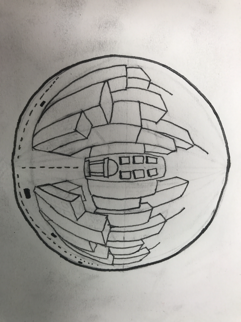 Five pointFor my 5 point I drew a city in a glass ball.
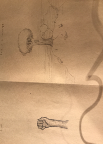 This is my nature scene and my hand. I do not like drawing hands because I can never seem your draw them correctly  This is my perspective scene before I learned how to draw it correctly. Here Is also my animal which I also dislike drawing because I can never get the lines curved correctly.
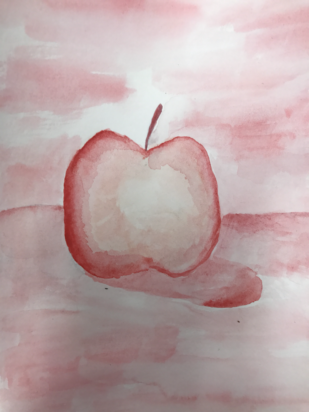
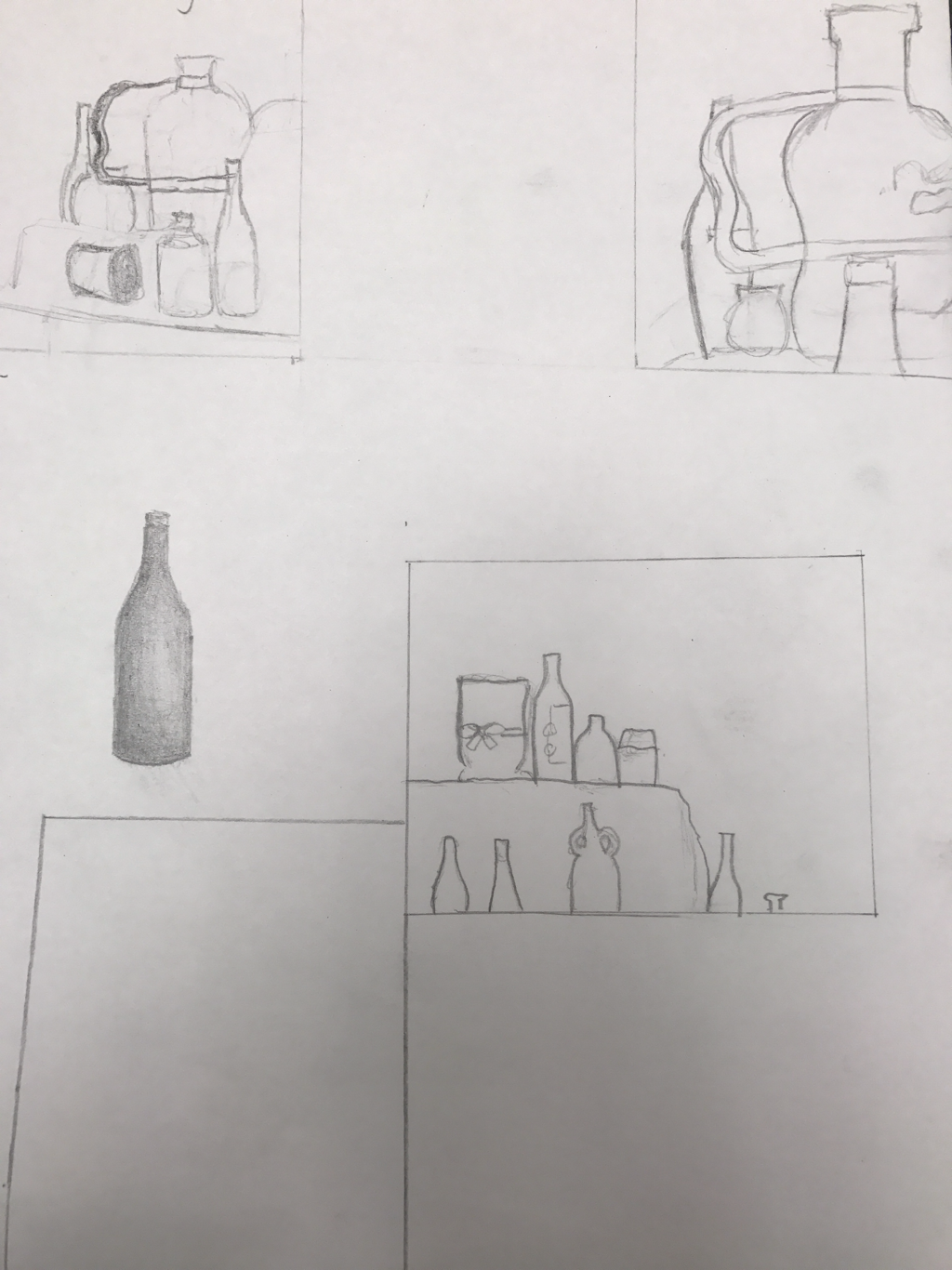 Compositional Sketches 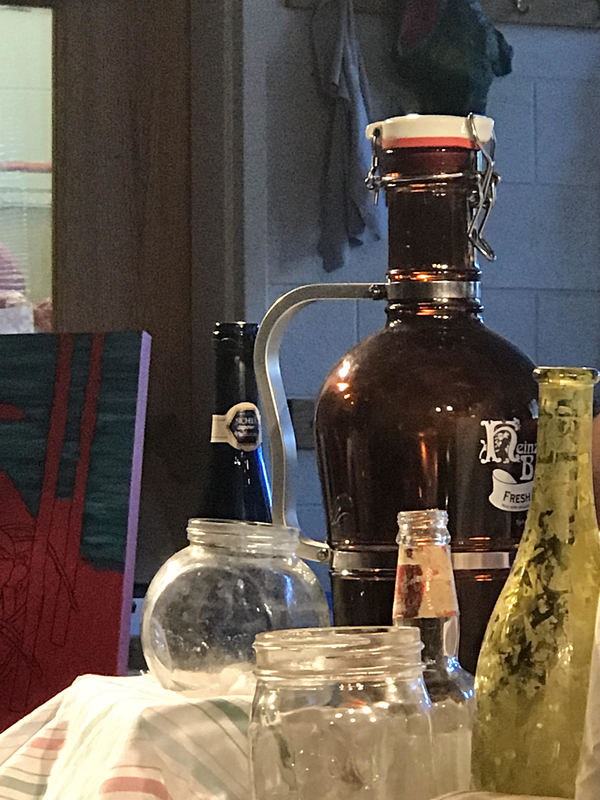 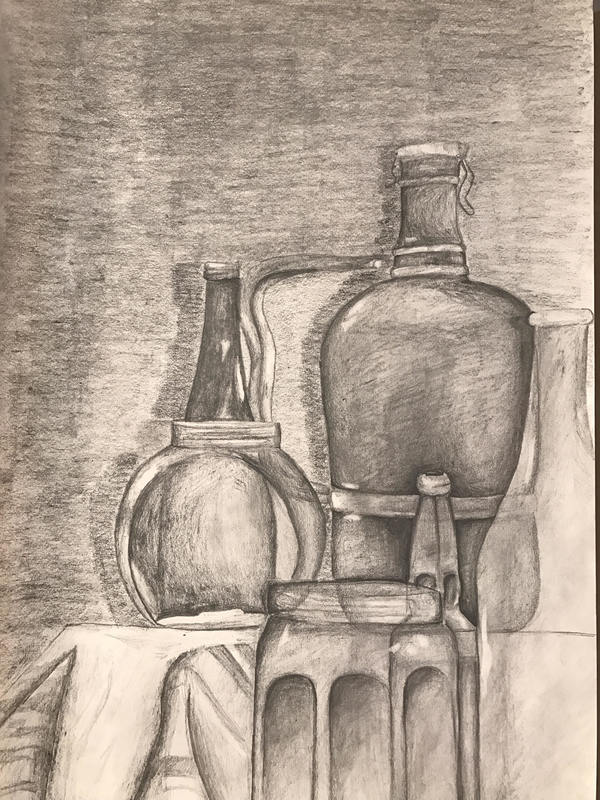 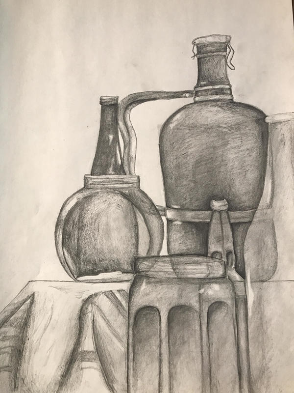 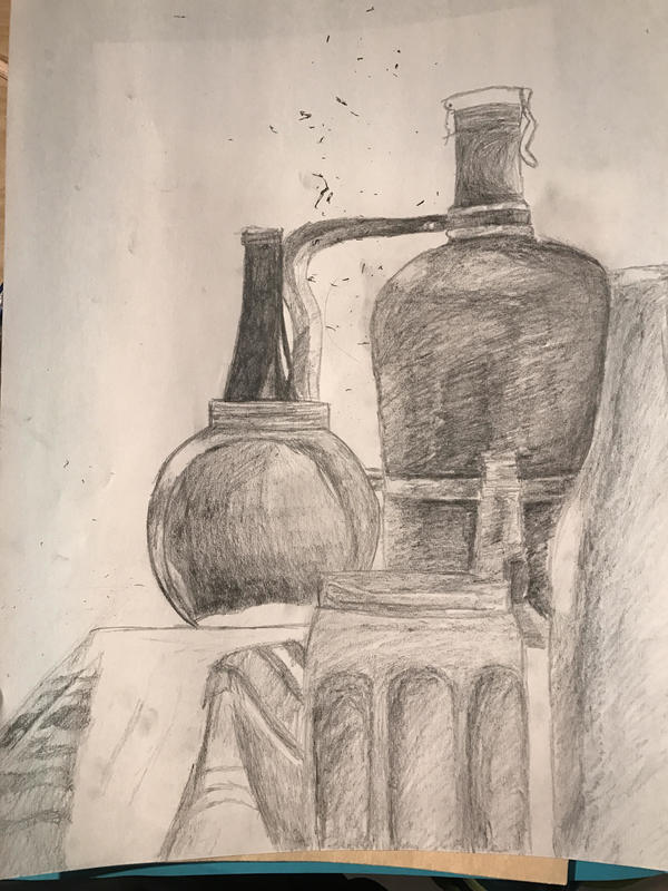 1.) I arranged my composition to reflect the smaller bottles closer to the front and leaving the larger pieces in the back. This allowed me to put more details into the piece. I used the rule of thirds to help align my piece so it would be visually appealing. I also used shading to make sure the piece was as lifelike as possible. I believe this was a very successful piece and it is by far my best drawing yet.
2.) I used a wide range of values from the darkest I could make the paper to not even touching it. This is evident in places where the bottles overlap. You can see the dark areas for the contrast against the other light bottles. The lighter values were used to show where the lights reflected off the bottles. 3.) When I first started this I was familiar with shading but after a few practice pieces I was able to copy what I learned in shading to my piece. This allowed me to shade much better than I previously have. 4.) I blended my values by going over the place I was shading once and then went back over again on the darker areas to make sure I would achieve the darkness I wanted. I also would apply more pressure on the areas I chose to make darker this would ensure they were exactly how i wanted them. 5.) In order to make the bottles as lifelike as possible I tried to capture the sleek and smooth texture of the bottles while correctly drawing the fabric which they were on top of. Without this the bottles would look much different and perhaps not even be recognizable. 6.) If I was going to remake my piece I would most likely try and make my darker areas a bit larger so that way the contrast would be greater. Another thing is I would most likely add the labels on the bottles into my drawing. This is because this time they were very hard to get right because of the curved sides of the bottles. |
AuthorJoshua Coady Archives
May 2017
Categories |
 RSS Feed
